

"Spotify
Insights"
Listening Analytics Feature Redesign
Role: Product Designer
Timeline: 3-4 weeks of active design work
Tools: Figma
Type: Concept/Independent Project
Plattform: Mobile App


02. Overview
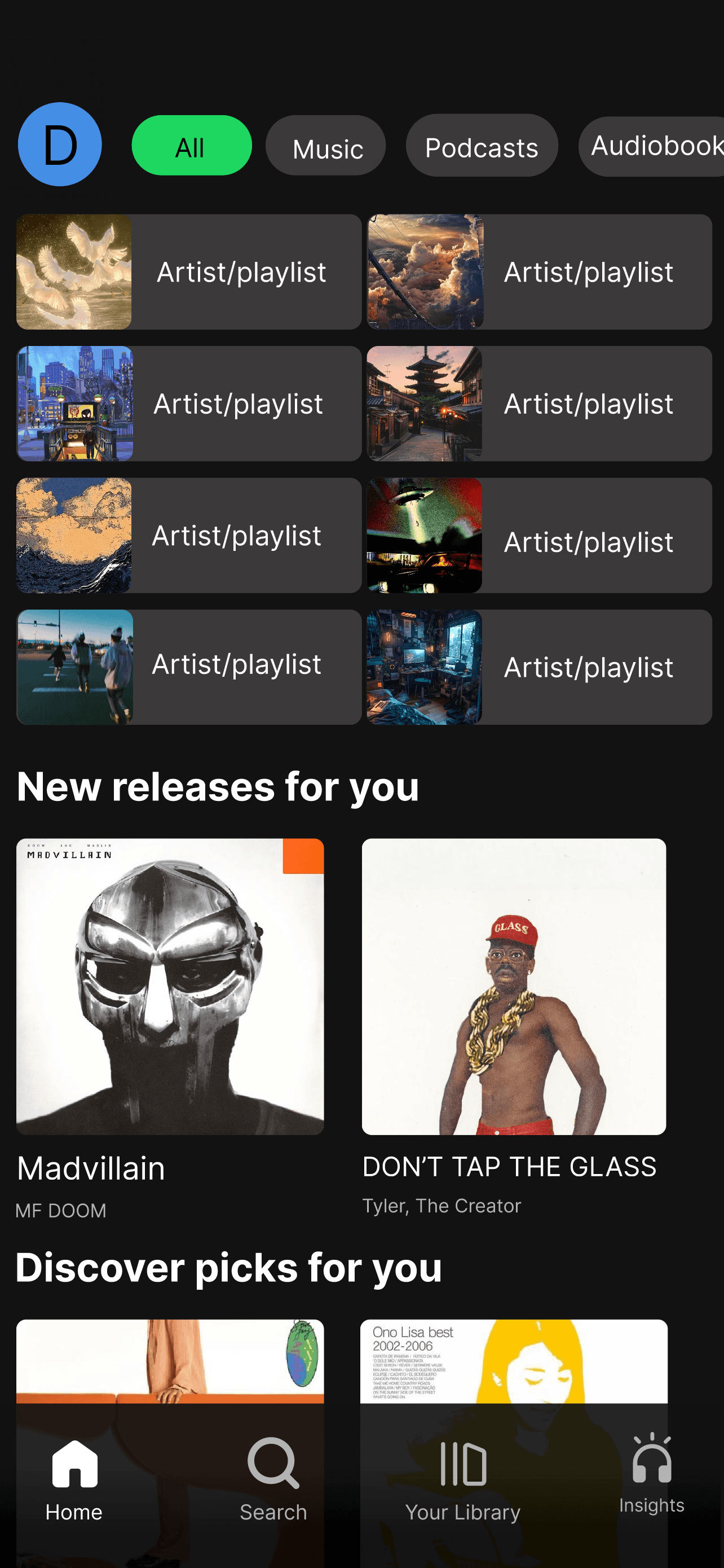
I redesigned Spotify’s bottom navigation by replacing the Create tab with an Insights page.
This feature allows users to view listening statistics across artists, songs, and genres directly
within the app. I built this because Spotify currently relies on third-party tools for detailed listening
insights, despite owning all the data internally.
03. Problem
Spotify currently surfaces user data in limited and indirect ways. The Create feature appears
twice, once in the nav bar and again within the Library, which makes the dedicated tab
feel redundant. At the same time, meaningful listening insights require users to leave the app
and use third-party sites. This creates a gap between Spotify’s data capabilities and the user’s
desire for self-reflection and personalization.
04. Goals
The goal of Spotify Insights was to design a data-driven mobile experience that helps users
better understand their listening habits while strengthening engagement with the Spotify
platform. The project focuses on transforming complex listening data into visually intuitive
insights that encourage exploration, personalization, and long-term user retention.
By prioritizing clarity, interactive feedback, and emotional connection to music identity, the
interface aims to make analytics feel engaging rather than purely informational.
05. Information Architecture
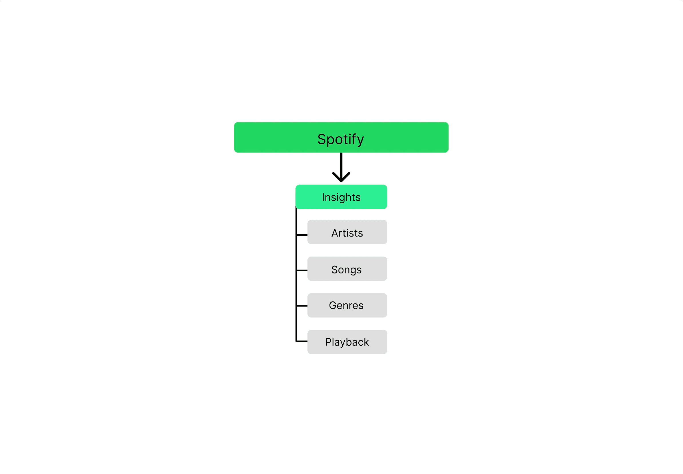
Artists, Songs, Genres, and Playback are the four main categories into which Spotify Insights'
Information Architecture divides user listening data. It is possible to explore listening patterns
intuitively because each category reflects an important aspect of user behavior. Clarity and
accessibility are given top priority in this framework, which allows users to swiftly switch between
high-level insights while preserving a scalable base for further in-depth analytics and future feature
extension.
06. Low Fidelity Screens
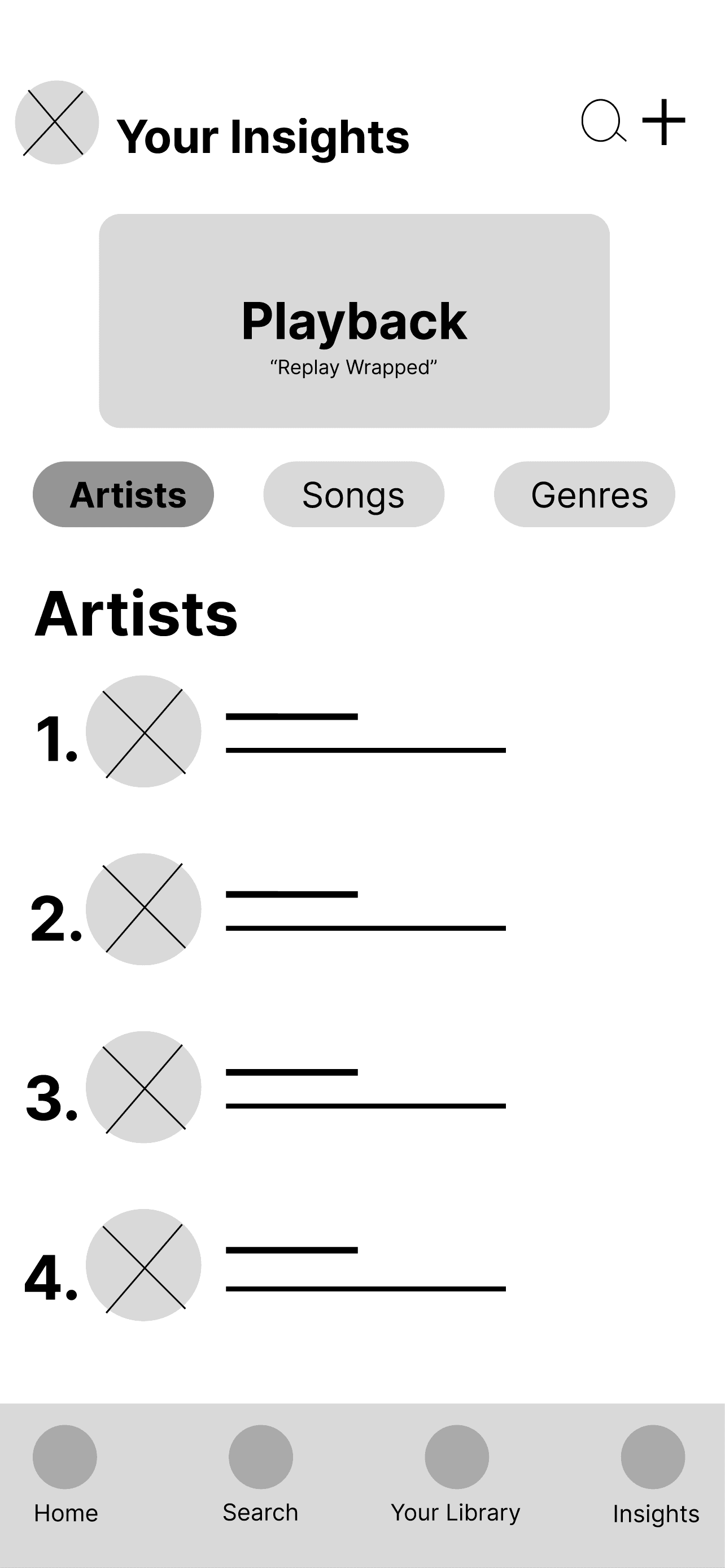
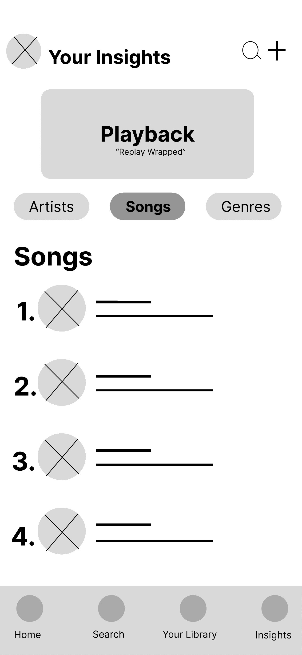
The Spotify Insights feature's structure and hierarchy were established using low-fidelity
wireframes, with an emphasis on arranging Playback, Artists, Songs, and Genres in a simple,
tab-based form. Prior to high-fidelity design refinement, this step verified the fundamental
navigation and data presentation.
07. Approach
I approached this from the perspective that users don’t just want music, they want identity.
Listening habits are personal. Instead of burying insights in settings or external platforms,
I made them a primary navigation destination. By integrating stats into the core UI, the app
becomes reflective rather than purely consumptive. When I personally used a third-party stats
site and discovered I frequently listened to pop, I explored that genre further. That behavior
increased my time in-app and expanded my library. Embedding insights directly into Spotify
could intentionally drive this same loop of discovery and retention.
08. Key Design Decisions
The Insights icon combines headphones and abstract “idea” lines to symbolize musical
self-awareness. Headphones represent immersion; the lines imply thought or realization.
Together, they visually communicate reflection through listening. I kept the icon’s stroke
weight, color system, and scale consistent with Spotify’s existing navigation to maintain
familiarity and reduce cognitive friction. The page is structured around Artists, Songs, and
Genres, categories users already understand. I also integrated a Replay/Playback module
so users can access yearly summaries without searching externally. At the top right, I added
a modified search bar that functions as a stats filter. Instead of general search, it allows users
to query specific artists, songs, or genres and instantly view their listening data. This reinforces
the idea that insights are exploratory, not static.
09. Systems & UI
Each content section (Artists, Songs, Genres) is built as a vertically stacked frame with clipped
scrolling to match Spotify’s existing content behavior. I maintained the platform’s active highlight
color to ensure visual consistency. The three sections were organized within a component set to
streamline interactions. While Spotify’s mobile UI does not rely on hover states, I created instant
state transitions between tabs to maintain responsiveness and structural clarity in the prototype.
10. High Fidelity Screens
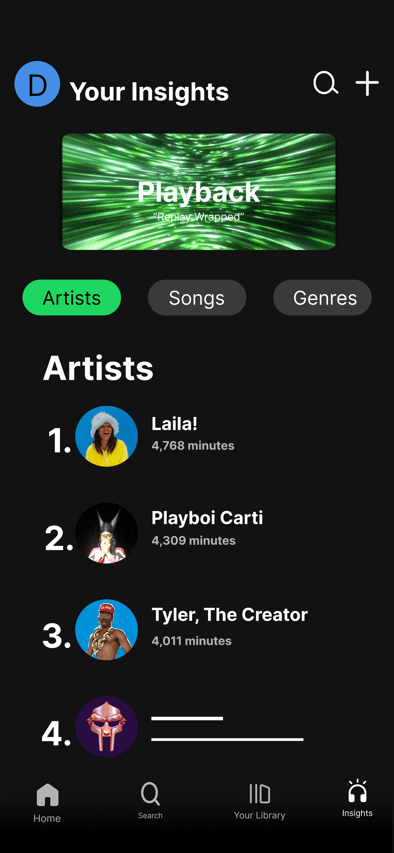
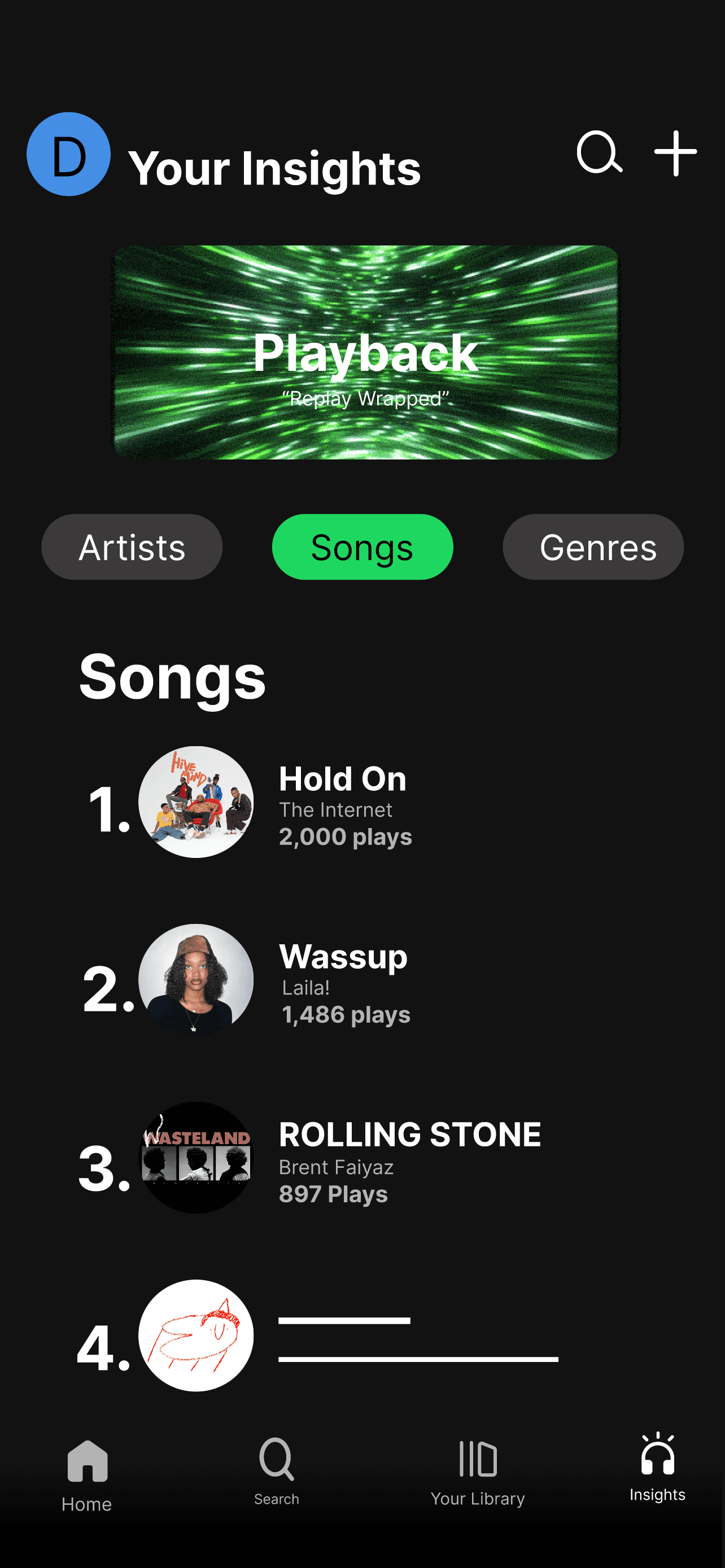
The final visual direction of Spotify Insights is displayed on the high-fidelity screens,
which turn early ideas into a unified and refined user experience. In order to emphasize
interactions, active states, and important data points, the design makes use of Spotify's
well-known dark interface while adding bright green accents. Through organized ranks,
legible font, and visually distinguishable indicators like minutes listened, play counts, and
percentage breakdowns, each section, Artists, Songs, and Genres, prioritizes clarity.
List elements were designed as reusable components to increase usability and
consistency. This allowed for effective scaling and made it possible for users to browse
and navigate between several categories in a single layout. The "Playback" feature
encourages users to return and interact with their listening habits by adding a dynamic,
immersive aspect inspired by Spotify Wrapped. All things considered, these screens
provide a customized and captivating insights experience by striking a balance between
utility and visual attractiveness.
11. Constraints
This was an independent concept project. I did not conduct formal user interviews or
usability testing, and I worked without personas or analytics validation. The assumptions are
based on behavioral observation and personal user experience rather than structured research
or team iteration.
12. Outcome - Intended Impact
The goal was to deepen personalization by turning listening data into a visible,
interactive feature. By making insights accessible from the main navigation, users can better
understand their preferences, encouraging exploration and longer session times. The intended
impact is increased engagement through self-awareness rather than passive consumption.
13. Reflection
Next, I would validate the hypothesis through usability testing with active Spotify subscribers.
I would measure whether surfacing insights in the main navigation increases engagement,
session time, and library exploration. I would also test whether replacing the Create tab impacts
content-creation behavior. Beyond validation, I would explore deeper personalization layers,
such as dynamic recommendations based on listening patterns or comparative social insights.
Any iterations would be driven by observed behavior rather than assumption.