01. Overview
Upswing is a longitudinal professional growth platform designed to move beyond the static
resume and networking feed model. While platforms like LinkedIn emphasize connection and
visibility, Upswing centers on verified growth over time. Users log roles, credentials, and career
reflections while inviting managers or colleagues to contribute external evaluations. A dynamic
trajectory graph visualizes the relationship between self-reported skill signals and external
perspectives, creating a transparent and evolving representation of professional identity.
02. Problem
Current professional platforms prioritize visibility over longitudinal growth. Profiles function
primarily as static biographies supplemented by endorsements or recommendations that are
often sporadic and surface-level. Performance review systems, meanwhile, remain internal and
siloed within organizations. As a result, professional identity becomes fragmented:
self-presentation exists in one space, formal evaluation in another, and long-term skill
development is rarely tracked publicly or cohesively. There is no centralized platform that
integrates verified feedback, credentials, and observable growth over time into a transparent
and evolving professional record.
03. Goals
The goal of Upswing was to design a SaaS platform that helps organizations visualize
employee development and performance progression in a clear, actionable way. The interface
focuses on transforming performance data, skill development milestones, and career pathways
into intuitive dashboards that support both employees and managers. By prioritizing clarity,
hierarchy, and decision-focused UI design, the product aims to make workforce development
data easier to interpret and act upon.
04. Information Architecture
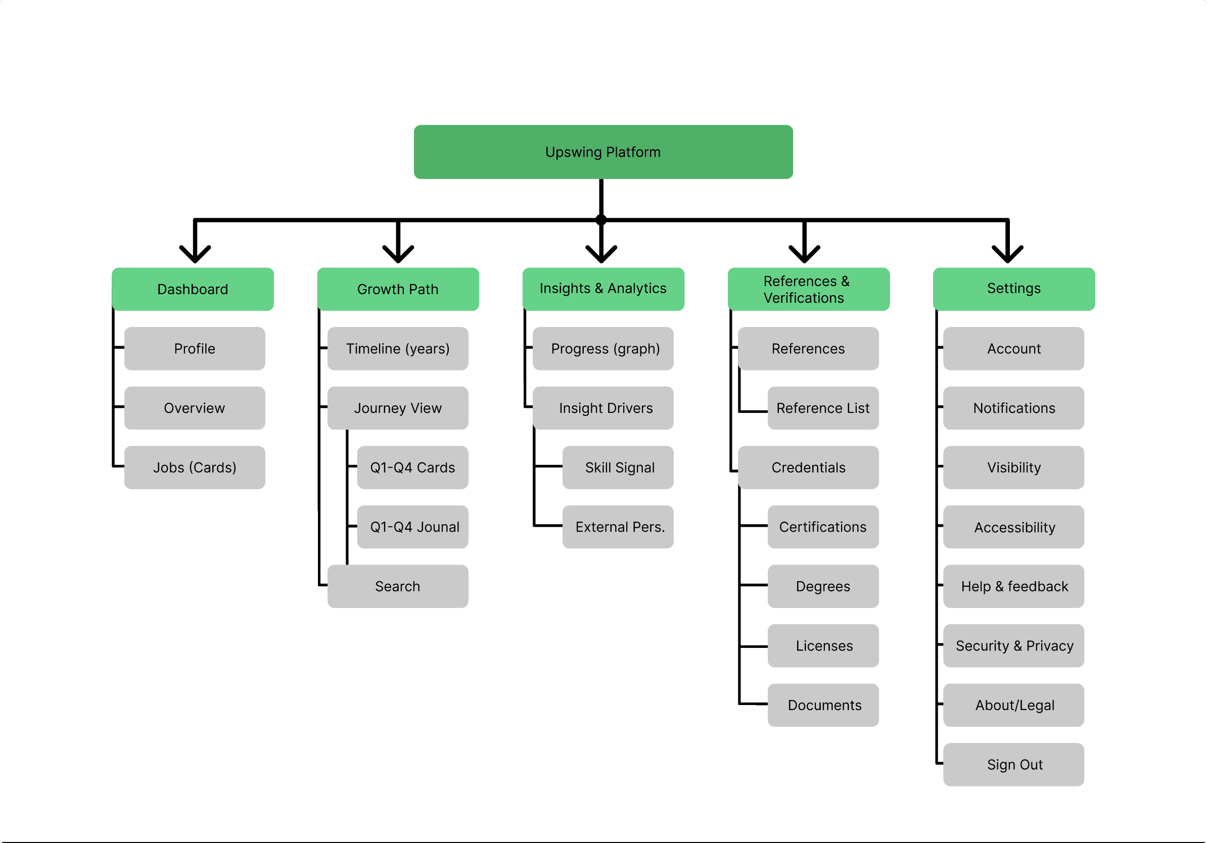
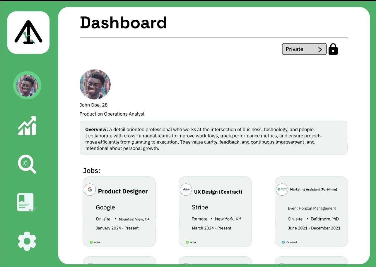
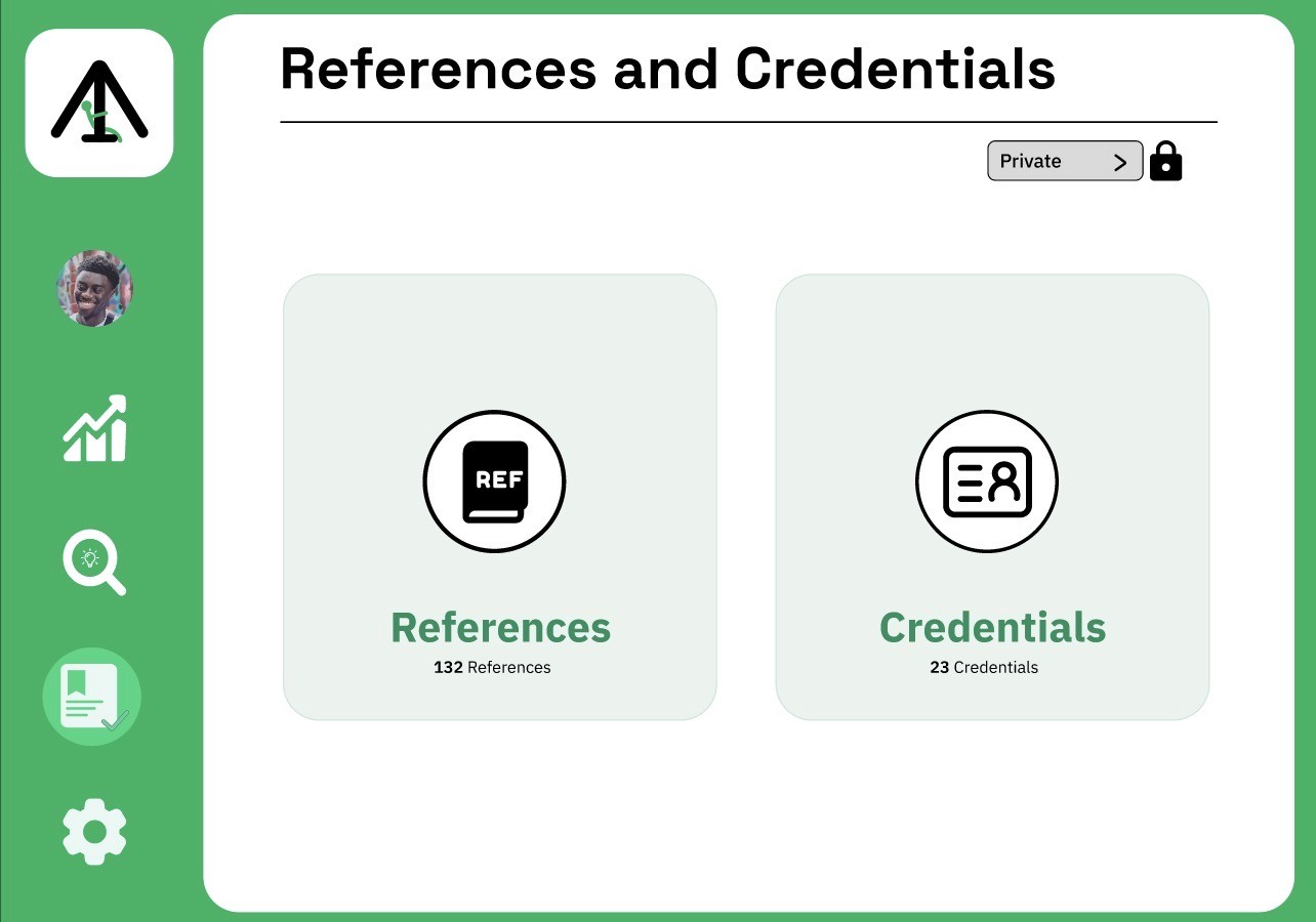
The five main sections of Upswing's information architecture: Dashboard, Growth Path,
Insights & Analytics, References & Verifications, and Settings, clearly divide professional
validation, performance tracking, and personal development. Users may easily navigate
between checking their current condition, investigating long-term growth, examining
performance trends, and maintaining credentials because each component supports a
different user purpose. Users can move from high-level summaries to more in-depth insights
thanks to deeper hierarchies in the Growth Path and Insights sections. This ensures that the
experience is scalable while reducing cognitive burden.
05. Low Fidelity Screens
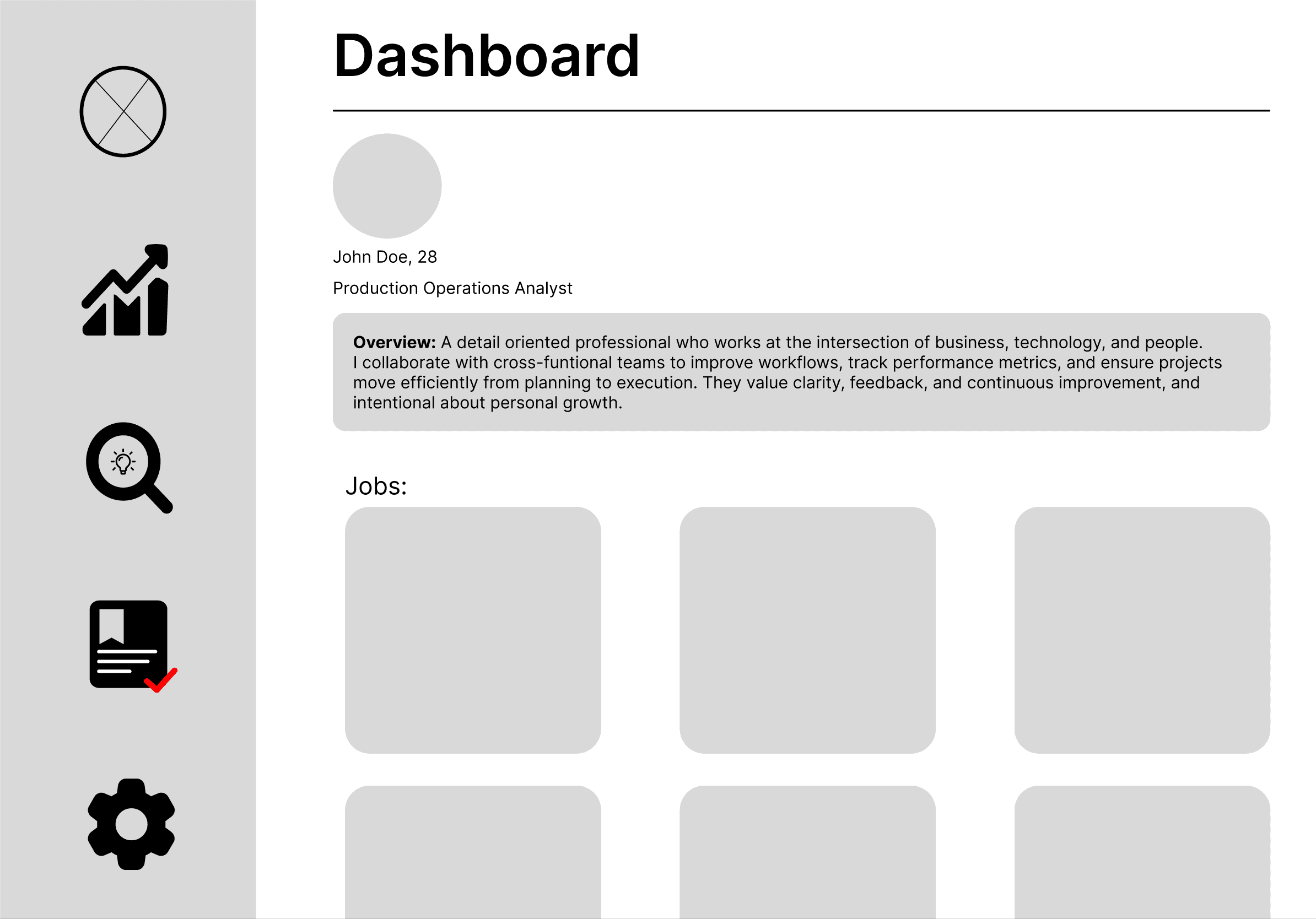
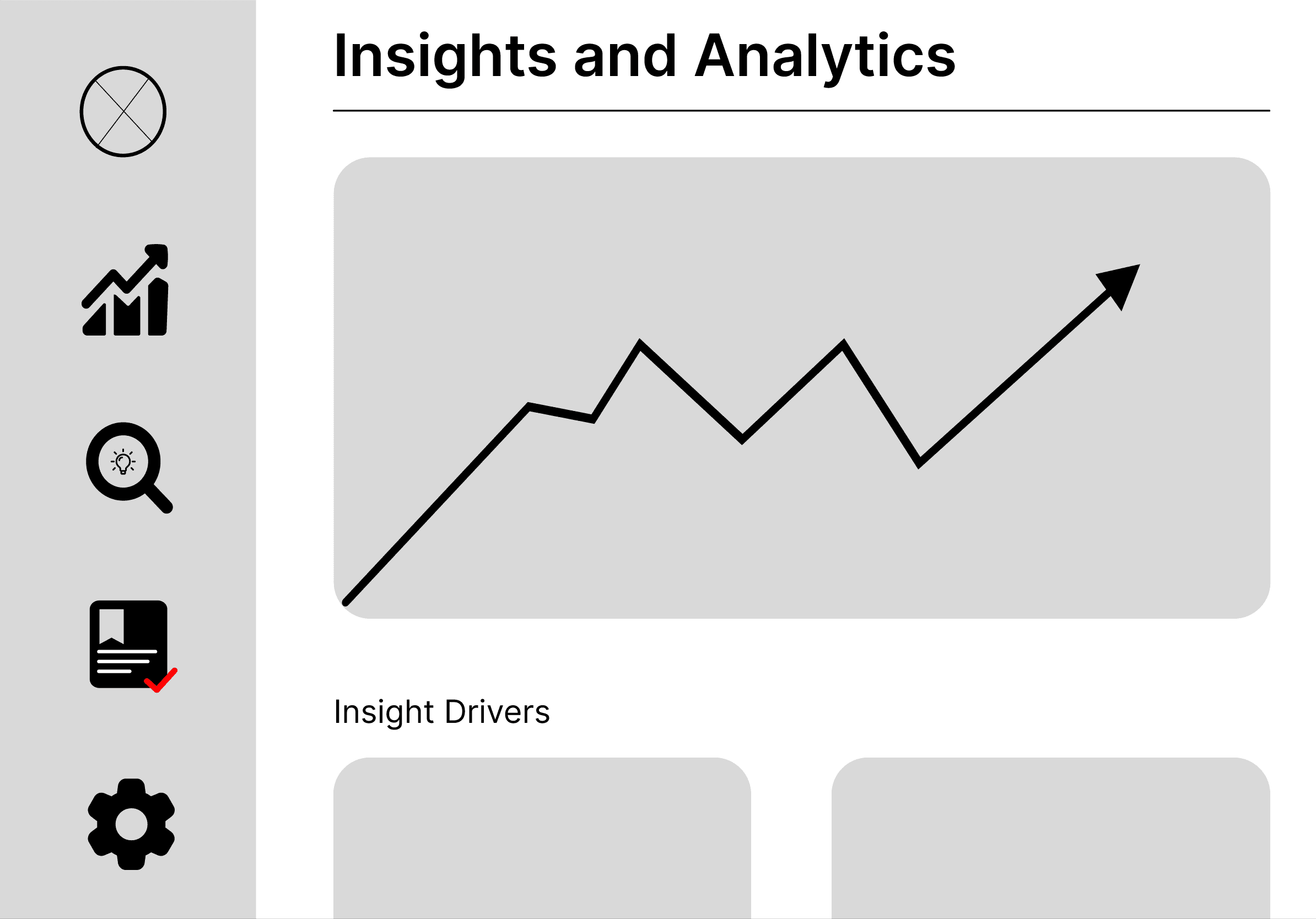
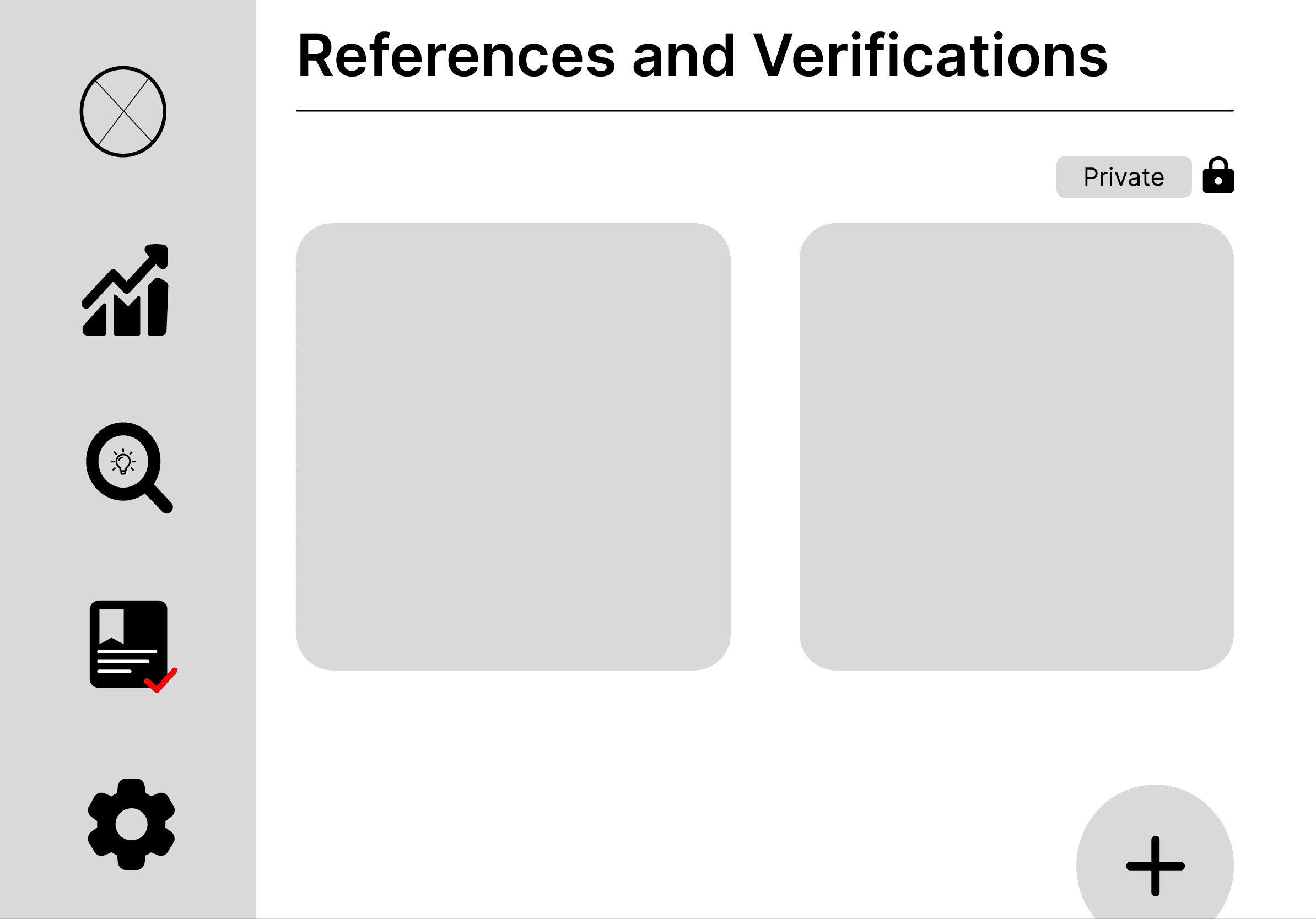
Prior to applying visual styling, these low-fidelity wireframes examine Upswing's basic
structure and user flow, emphasizing hierarchy, clarity, and ease of use. With a permanent side
navigation, users can easily access their profile, job-related insights, growth monitoring, and
performance data thanks to the design' emphasis on a dashboard-first experience. To evaluate
content organization, spacing, and interaction patterns, each screen, Dashboard, Growth Path,
Insights & Analytics, References, and Settings, was purposefully divided into modular pieces. In
order to ensure that the final design would support intuitive progression, clear data exposure, and
a consistent user experience across all major functions, this stage allowed for quick iteration on
layout decisions like card placement, information density, and feature prioritization.
06. Approach
I approached Upswing from the belief that professional identity is currently fragmented across
static resumes, networking feeds, and internal performance systems. Because hiring decisions
often rely on snapshots rather than trajectory, I centered the product around longitudinal growth
rather than presentation. The core design principle was balancing self-authored identity with
externally validated feedback. Self-reported skills provide context, but without outside perspective
they risk bias. Conversely, external evaluations without personal narrative lack depth.
By combining “Skill Signals” (user-reported growth) with “External Perspective”
(manager or colleague input), the platform attempts to reduce information asymmetry in hiring.
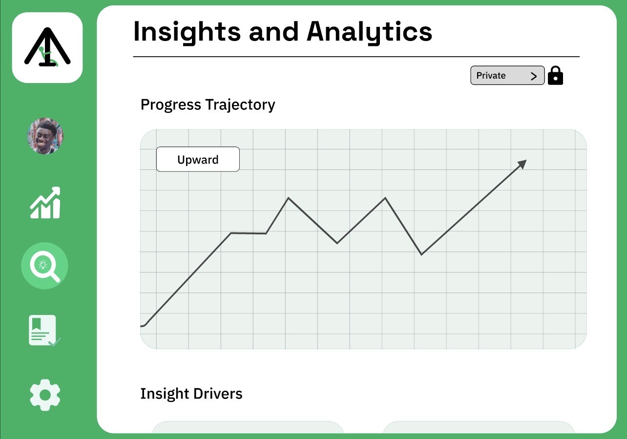
The trajectory graph became the structural anchor of the interface. Instead of listing
achievements chronologically, growth is visualized dynamically to reinforce progression over time.
Privacy controls were intentionally embedded into the system to address the tension
between personal reflection and public professional optics. The product was designed not as
a social feed, but as a living performance record, one that evolves as users refine skills,
receive feedback, and build credibility.
07. Key Design Decisions
Several key design decisions shaped Upswing’s structure and interaction model. First,
the trajectory graph was positioned as the visual anchor of the platform. Rather than relying on
a traditional chronological resume layout, growth is represented dynamically to emphasize
progression over time. This choice reinforces the platform’s core premise: professional identity
is cumulative and evolving, not static. Second, Skill Signals (self-reported competencies)
were intentionally separated from External Perspective (manager and peer evaluations).
Combining these into a single metric would have simplified the interface, but separating
them preserves nuance and reduces bias. The visual contrast between the two allows users
and employers to assess alignment between self-perception and external validation. Third, the
interface avoids a feed-based or engagement-driven layout. Unlike LinkedIn, Upswing does
not prioritize visibility through posts or activity. This decision shifts focus from performance-based
signaling to documented development. Finally, privacy controls were embedded directly into the
layout rather than hidden in settings. Because professional identity can be sensitive, users must
be able to toggle visibility without compromising structural clarity. This reinforces trust while
maintaining platform transparency.
08. Systems & UI
Upswing was structured around a reusable component system to maintain consistency
across multiple visibility states and content variations. The primary navigation was built as
a modular component with defined hover and active states to ensure predictable interaction
behavior across pages. Because Figma’s component state limitations affected persistent
active transitions, navigation states were separated to preserve visual clarity and smooth page
feedback. Each primary page includes smart animate triggers to create seamless state
transitions without disrupting layout stability.Content modules such as profile cards, reference
blocks, and credential sections were designed as scalable components with hover interactions
to reinforce interactivity. A persistent privacy control bar was built as a reusable element and
anchored consistently across layouts to maintain structural integrity despite varying page lengths.
This modular approach ensured visual consistency, interaction predictability, and scalability as
content depth increased.
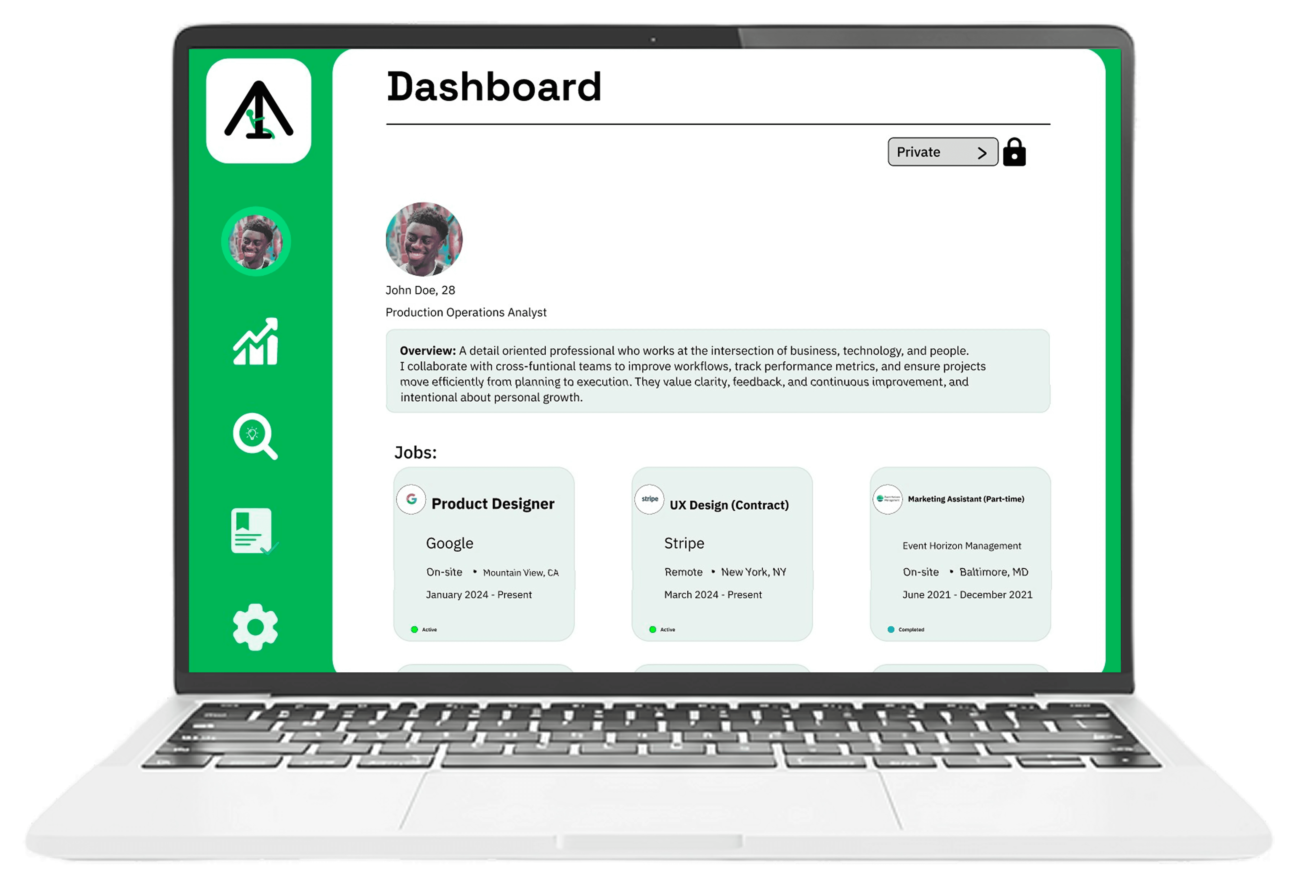
09. High Fidelity Screens
Upswing's high-fidelity designs combine the platform's primary objective, promoting organized
personal and professional development, into a clear, user-friendly interface that places an
emphasis on introspection and clarity. From the dashboard overview and job tracking to more
in-depth self-development tools like Growth Path and Insights & Analytics, every screen is made
to lead users through their journey. While card-based layouts, a clear hierarchy, and few
distractions guarantee that information is simple to scan and act upon, the adoption of a
consistent green scheme encourages progress and stability. A seamless experience that strikes
a balance between data and introspection is produced by features like quarterly reflections,
trajectory visualization, and well-organized credentials, which enable users to not only monitor
progress but also comprehend it over time.
11. Constraints
Upswing was developed as an independent concept project without access to formal
user interviews or structured usability testing. As a result, product assumptions were
informed by observed gaps in existing professional platforms rather than primary research
validation. Additionally, the project was built while refining my use of components and auto
layout in Figma. Designing system-level interactions required iterative adjustments, which
extended development time but ultimately strengthened the structural consistency of the interface.
12. Outcome - Intended Impact
The intended impact of Upswing is to shift professional identity from static presentation to
longitudinal credibility. By combining self-reported skill signals with externally validated
perspectives, the platform aims to reduce the reliance on snapshot-based hiring decisions.
For users, the outcome is greater agency over their professional narrative. Instead of periodically
updating a resume, growth becomes an ongoing, visible process. For employers, Upswing
introduces a more structured way to assess trajectory rather than isolated accomplishments.
If implemented at scale, the platform could increase profile revisit rates, encourage ongoing
skill documentation, and improve signal clarity in hiring by presenting both self-perception
and external validation within a single framework.
13. Reflection
Upswing represents an ambitious reframing of professional identity, and its scale introduces
meaningful questions that would require validation. The next step would be structured user
research with both early-career professionals and hiring managers to assess whether
longitudinal growth tracking meaningfully improves hiring confidence or simply adds
informational complexity. One area for iteration would be refining how Skill Signals are
quantified and displayed. Over-simplifying professional development into a single trajectory
risks reducing nuance, while over-complicating the visualization risks overwhelming users.
Future exploration would focus on balancing clarity with depth. This project reinforced the
importance of system-level thinking early in the design process. Building scalable component
structures and permission states highlighted how product architecture shapes experience long
before visual polish.
Role: Product Designer
Timeline: 3-4 weeks of active design work
Tools: Figma
Type: Concept/Independent Project
Plattform: Desktop
"Upswing"
Professional Growth
& Career Analytics Platform
